ActiveWin is a full-service Digital Marketing Agency based in Manchester. Specialising in building bespoke campaigns that return investment for clients.
ActiveWin Media
ActiveWin Media
2019
Branding, UI Design, UX Design, UX Research
THE PROBLEM
The site was five years old and had been built quickly using a basic template. It was now dated in look, didn’t reflect the size and personality of the agency, had poor technical SEO, and delivered very little leads.
The brief was sales driven so it was important to increase leads via phone calls and emails, improve the aesthetics of the site, reflect the personality of the business and improve technical SEO to get ActiveWin visible on Google.
THE SOLUTION
UX Research
I focused my attention on a competitor review, looking at the top 50 agencies in the north to get a feel for the type of content, the tone of content, navigation headings, sections, and use of imagery.
I made a list of sections used by agencies and over 90% had the same five sections – Home, Work, Services, About, Contact. This was clearly the blueprint for our agency to start from. I produced a Content Audit which listed all the pages we needed and then worked from a component list to populate each page.
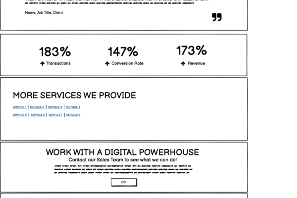
Components to consider included: Testimonials (Clients/Staff), Request a Brochure, Showreel, Get in Touch, Clients, Stats, Social images (slider), Awards/Compliance, Social Sharing, Live Chat, Pull Quote.
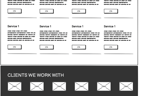
Services Priority List – I surveyed different members of the senior management team to prioritise services. Each was given a score and the most popular service was placed at the top of the services page (and featured on the home page). The least popular service was relegated to the bottom of the services page.
UX Design
Site Map was developed based on the competitor review that identified Home, Work, Services, About, Contact as key pages. These sections became the nucleus of the Site Map.
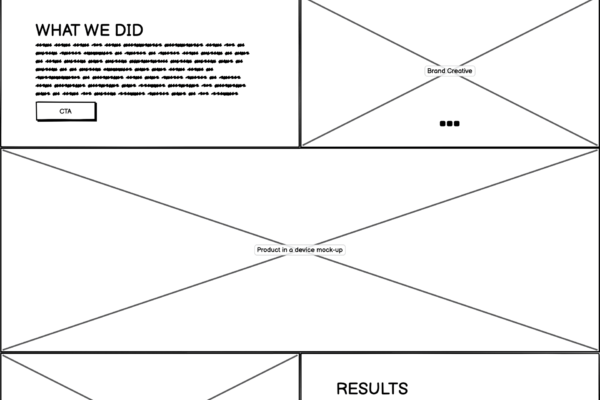
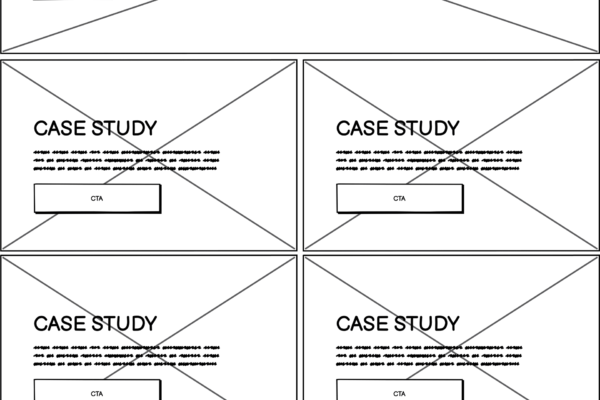
Wireframes were then made using the site map and component list, ensuring the business goals were considered i.e. placing phone and email links in the header and creating a sign posting component on every page to direct visitors to getting in touch. Also made contact a key feature of the footer.
I provided the content team with the content audit and the wireframes and asked them to write content for each section on the page and each component on the page.
UI Design
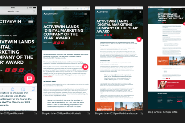
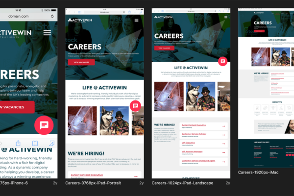
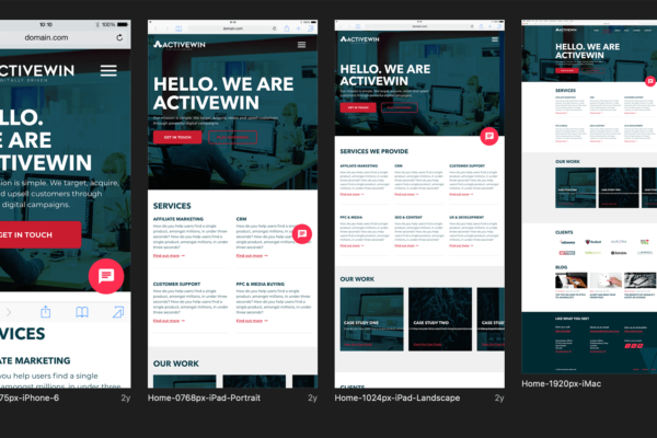
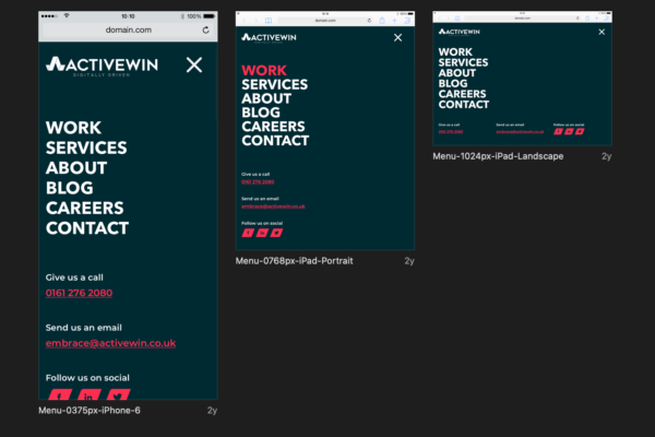
Mocks – ActiveWin had recently been redesigned so I used the new brand guidelines and made an online style guide in Sketch. I then created all the components and key pages. There were a lot of individual styles to each page and so I ended up having to mock most of the pages on the site, across four device types for each: Mobile, Tablet (landscape & portrait), and Desktop.
Assets were then prepared in Zeplin for Developers to download. Zeplin also provides the HTML/CSS which is much appreciated by the dev team! View Mocks >
Throughout this project I liaised with internal departments (Content, Design, Development, Sales, SEO) and stakeholders (Project Managers, Directors), and external suppliers (Photographer).
RESULTS
- Increase in leads (emails & calls)
- Site reflects the personality of the business (staff and office environment)
- Site is on brand! (reflects the new branding)
- Improved SEO
- View Website >
”Dave had the belief, bravery and creativity to revolutionise the website whilst retaining the agency’s core identity. Dave's consultative approach allowed him to incorporate the feelings across all departments and deliver a best in class lead generation website in the required timeframe.
Brian YoungSales Director

